Government of Ontario Internship
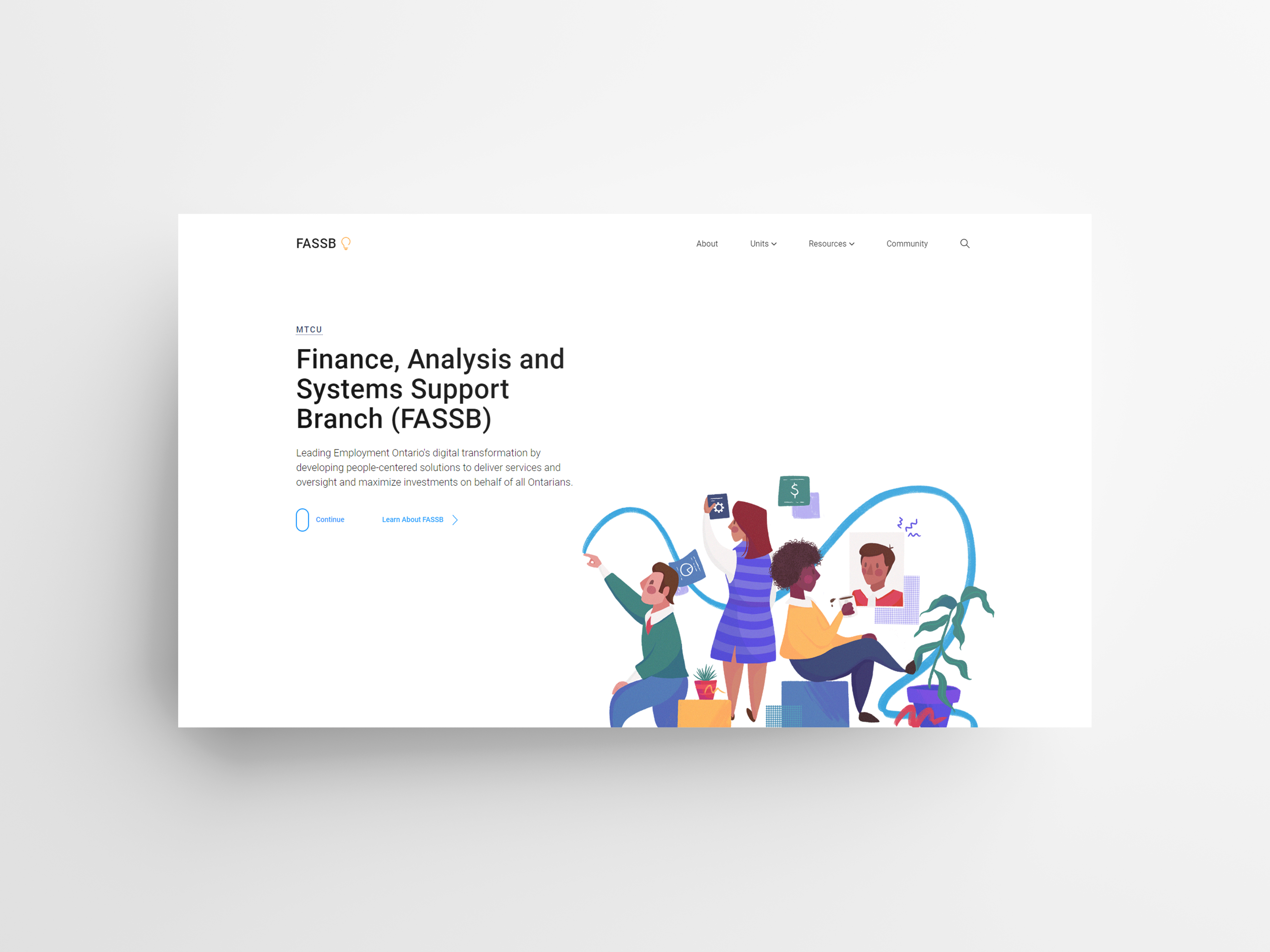
In 2019, I had the opportunity of interning as a User Experience and Web Designer for one of Employment Ontario’s Toronto based branches, Finance, Analysis and Systems Support Branch (FASSB). During my time there I took on the role as co-lead designer along with fellow co-op student Emily Lilek for the complete re-design and re-development of their internal website.
Background
FASSB is a key government branch that is leading Employment Ontario’s digital transformation. When I started at FASSB it was clear they had their work cut out for them in terms of their own digital transformation. We noticed right away that branch employees didn’t have a centralized location where they can access company resources, guides, or any general branch information. This is an issue common in government institutions as there is an abundance of resources, but a lack of access or lack of knowledge on where things digital documents are kept.
We determined an internal website could act as the jumping off point for branch employees to retrieve information and resources efficiently. On top of this, by using a CMS (Content Management System) such as WordPress it could give employees the ability to easily up keep the site themselves once we finished our internship.
My Role
My university colleague and I led the interaction design, graphic design and web development of the internal portal from April 2019 until the end of my internship in August. I collaborated with multiple team leads and business coordinators at FASSB. The whole process included design workshops, focus groups, IA research, wireframing, prototyping, final design specs, A/B tests and web development through WordPress.
Discovery: What type of info do people care about?
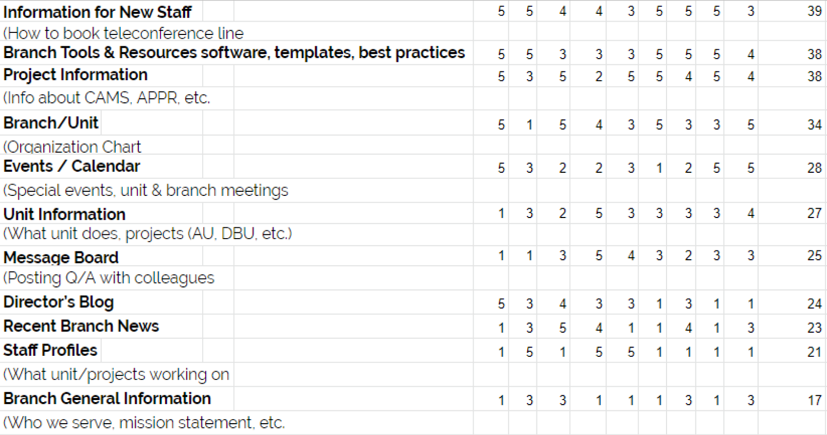
In order to ensure we had a good jumping off point to start wireframing, we wanted to make sure we had a full understanding of what type of information the employees of FASSB had difficulty fetching, and any workarounds they've become accustomed to. We held 2 focus group sessions where we held discussions and ran open card sorting activities. Each employee would write down what type of branch information they felt was most important to them and then logically organized them into groups.

Card sorting activity among staff.

Card sorting summary.
Define
Through the analysis of our focus groups and our own 1-on-1 interviews with team leads, we summarized the data into 3 key insights along with a HMW statement. The first insight highlights a lack of an on-boarding process which could be an entire project in itself, but this was important to identify as we saw it as an opportunity. Making resources that are geared towards newer employees easier to access was now in the forefront of our mind. The second insight was a need for an understanding of which projects are on-going and which unit is taking the work on, it became clear that there was a lack of transparency in the organization which we could tackle directly. Additionally, we identified there was no centralized location for data as documents were spread around in different drive locations, therefore creating a burden for employees who had to spend more time searching for their desired data.
Key Insights
-
Little to no on-boarding process for new employees, leaving new employees having to spend time asking around or searching aimlessly
-
Lack of transparency around the organization's different units and their current undertakings such as key projects, overall direction and activity
-
No data centralization or method to locate org. documents employees commonly need
HMW Statement
“How might we enable FASSB employees to find branch information, their required resources, and answers to common questions in an efficient and user-friendly manner?”
Ideation and Evaluation
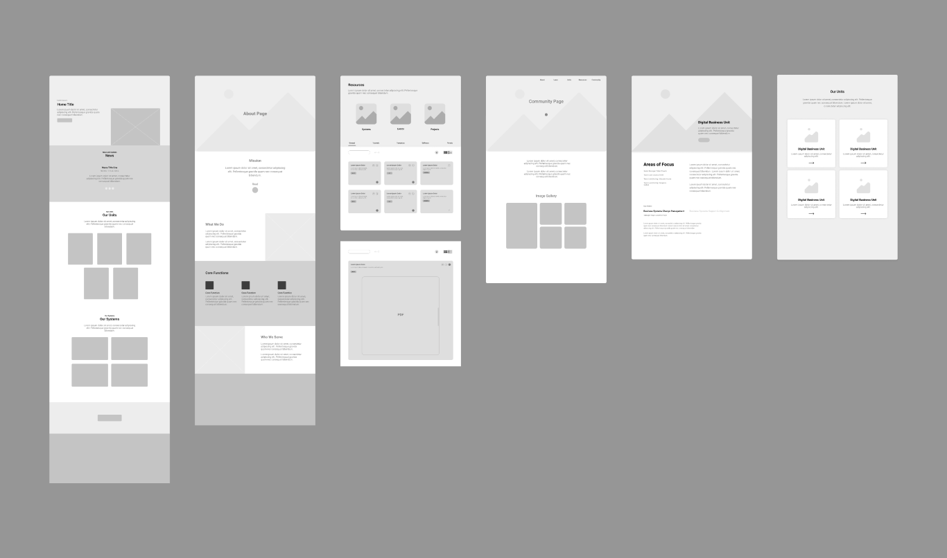
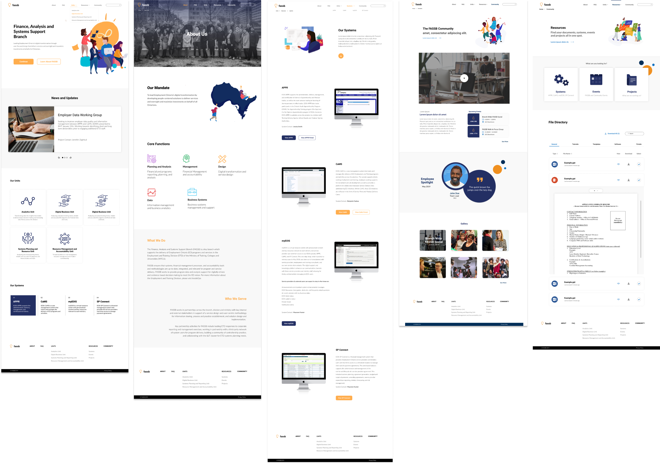
After getting a good idea of the problem space and what we wanted to address, we began producing some wireframes along with low fidelity mockups to test in our reoccurring focus groups. During these focus groups, I was able to observe how participants interacted with the prototype and got positive feedback on our decision to modernize using increased whitespace, font overhauls and more intuitive iconography. We then designed our first high fidelity mockup based on this feedback.

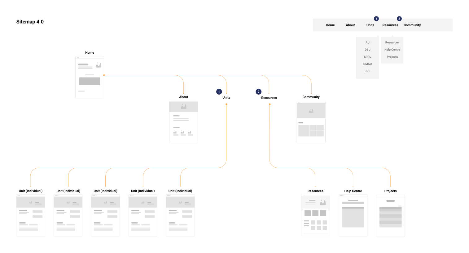
Sitemap refinements structured from our findings.

Wire-framing.

First draft of high-fidelity designs.
Development
The larger part of the project revolved around the development phase as we decided to develop the entire site from scratch utilizing Webflow to build the structure of the site, then exporting this code and building it into a custom WordPress theme. This gave us a lot more customizability and at the same time tackled major issues in responsiveness and compatibility.
I took a lead role on this front as I had the most experience in web development on my team. During this phase I had to learn how to utilize WordPress on an offline server, modify it through PHP and hand-code the site once our frameworks stopped working.
Final Testing and Handover
Once the website was finally developed and we were closing in on our launch date, we reached out to 12 other employees and asked them to use our website on a local environment and provide any feedback they had. In the end we received mostly positive responses and incorporated the feedback into the final product just before launch. Running this testing period not only gave us insight into some of the paint-points real users have that we might have overlooked, but also identified any bugs or incompatibilities that we could fix to create a truly polished product.
This left us with one final week to organize and document everything we’ve done as well as create walkthroughs/tutorials for the next co-op students.
Results and Takeaways
After going live with the website, Emily and I were able to track its use with Google Analytics and we noticed it began gaining significant traction over the previous site. Additionally, I received a lot of positive feedback on the new simplistic and easy to navigate design along with the new file housing feature. The new ability to access company files in such an efficient manner meant that it would save employees a lot more time in their daily work.
As a takeaway, I think that our team should have communicated the projects expectations better and in a way that every member could fully understand. At the beginning of the project, the tasks I was given didn't seem too overwhelming until I started working on the site and I began to feel swamped. I believe this was because I didn't fully realize how much work was expected of me, and on the other hand my team leaders didn't know exactly how much work it would take to make their desired product.
I was able to re-develop the website and learn how to use WordPress at a high level with just enough time to spare, however if we spent more time at the beginning of the project realizing the team's expectations, we could've planned more efficiently and saved time to build the site in an even better manner. If this was the case and we had extra time, I would've liked to spend more time gathering quality company content and running through more usability tests with the employees.

