The Green Room

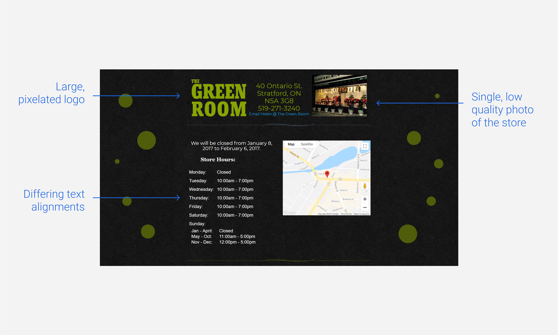
The Green Room is a local store of Stratford, Ontario that carries a variety of items that cater towards vintage-style women's clothing. In it's current state, the website implements minimal design principles and does not provide enough content, an aspect new customers would most certainly find useful.

Current Design and Issues

In general, the colour scheme and design choice of the current website is sub-par. There are no visuals besides the small image of the storefront, and there is little organization of content as it is all on one page without any navigation feature.

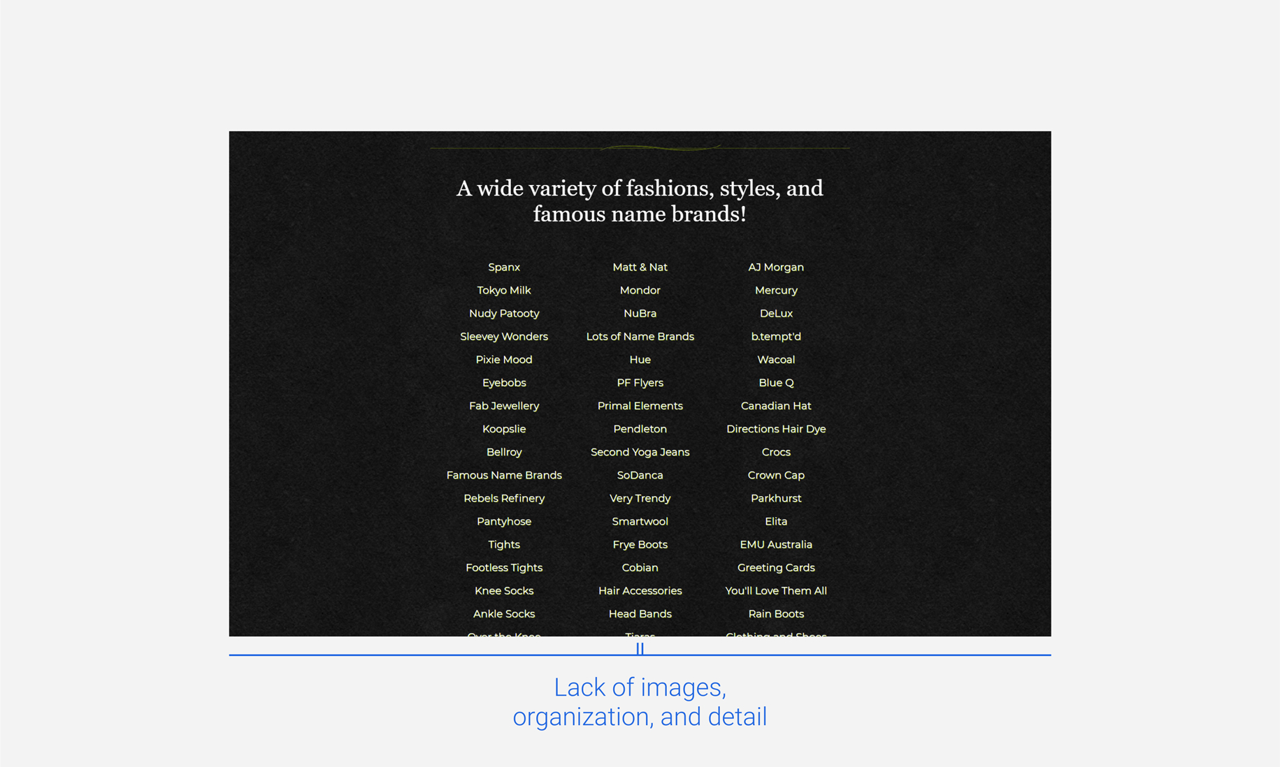
Along with this, the items that are in store are laid out in one massive list with no organizational features or images. This is one of the main functions of the website and having it organized in a poor layout can lead to customers not finding what they're looking for.

Gathering Insights

Before designing the new website, my teammates and I asked ourselves a few important questions: Who is this website for? Why do people visit the website? What are the visitors trying to achieve? What do the visitors need? To answer these questions we conducted research online and visited the store in person to get a sense of the store's mission and its customers goals.

In doing so, we were able to identify that: The Green Room website is primarily used by customers that tend to be fashion-oriented women as their products are mainly geared towards female vintage-style looks, and the purpose for visiting the website is to see what the store has to offer. The only other function being a map and store hours. This means that most often, visitors are trying to determine whether or not they are interested in going to the actual store. The web page acts as a catalyst to interest people to the store as there is no online shopping functionality, thus no profits to gain directly on the website.

With all of this in mind, our approach to the redesign is to refine the website's current design and functionality so that customers can easily see if a desired item or brand is carried, and to entice customers to visit in person.

Validating and Developing Designs

#8FA98D
#FFFFFF
#000000

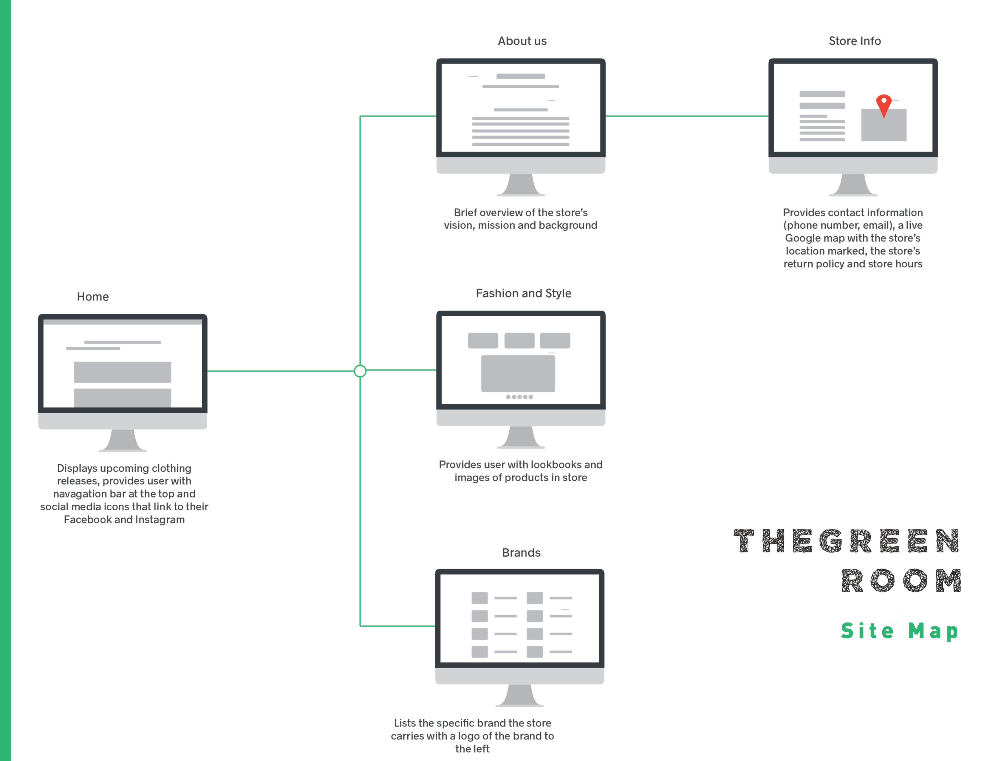
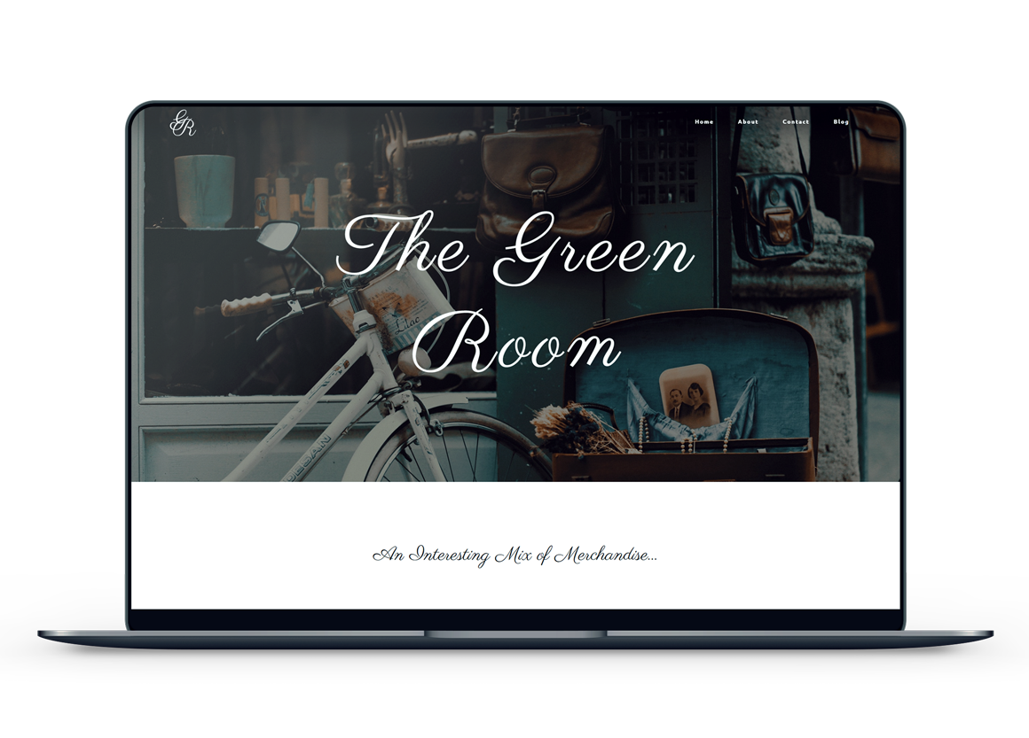
To begin creating our redesign, we wanted to transfer the feel and look of the store to the homepage. Therefore we designed it using a stock photo of a similar storefront and handwritten style cursive text to give a rustic and antique feeling. This page introduces visitors to the company and the store's theme, and it also provides tools that let them explore the rest of the site. This was an important function we wanted to add because one of the biggest issues with the original website was the lack of navigation. Due to this we created additional 'About' and 'Contact' pages and a clear navigation bar fixed to the top of every page.

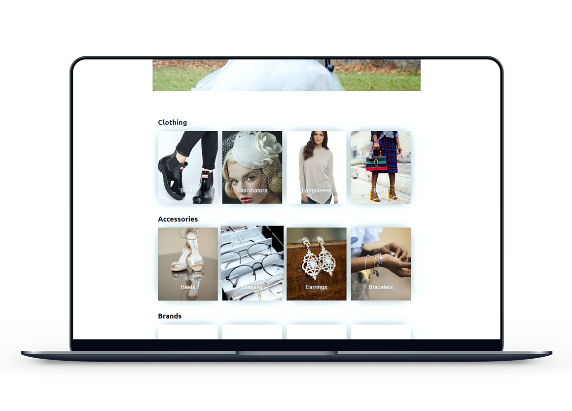
To go along with the website's original values, we wanted to give attention to the store's mission and why it is cherished by their customers. Consequently, there is a short description of the store's goals before diving into the items they carry. This is then followed by a gallery with photo-shoot-style images to showcase the looks and styles that can be created with The Green Room's clothing. Then we implemented a grid-style gallery to organize and display the items and brands carried by the store, instead of it being in one giant list.

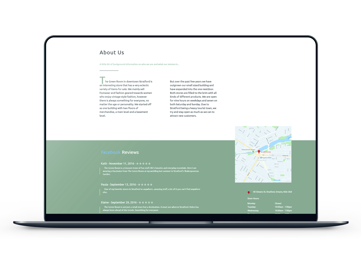
The 'About' page's main purpose is to communicate to customers what the store's mission and values are, how they successfully meet customers needs, and general store information. As the original website values the reviews they've received on Facebook, we included this in the 'About' page because it provides a higher chance of attracting customers. As well, there is an interactive map with store hours below so visitors can plan their visit efficiently.

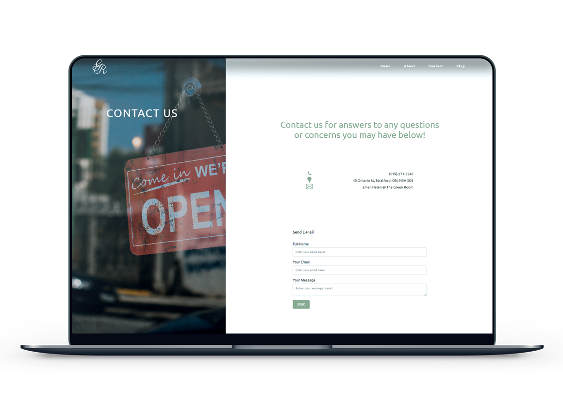
Finally, the 'Contact' page provides two methods to contact The Green Room in addition to their social medias links. Visitors can contact the company through the provided phone number/email or they can complete the short PHP form on the page itself.
My goal in designing the homepage was to create a very positive impression on user's first glance and to communicate the theme of the store. After visiting the store in person I immediately got a fancy yet vintage feel from the store itself and the items they carry. I decided to translate this to the website using rich colours, cursive text and a clean interface.

A major drawback that I noticed when using their website was the poor organization of the items they carry. In my redesign I picked out the three most common categories in their list and organized them into their own tray style gallery. This gallery function contains the most broad topics/items and when one is clicked it will filter into even more subcategories.

As stated in the design rationale, customer reviews are important to The Green Room and because of the overwhelmingly positive Facebook reviews and the effects they can have on new customers, I included them in the redesign. I also implemented a short mission statement from the company to give visitors some insight into their history and motivations.

Since there was no clear location to contact The Green Room on the original site, in the "Contact' page I provided multiple methods to reach the company. I felt that a PHP form was important to include because of its general ease of use for visitors.

Next Project